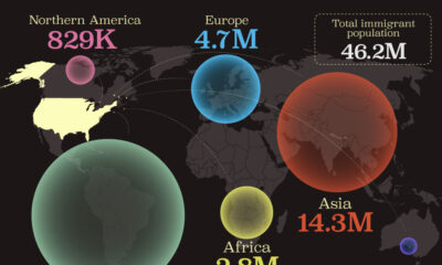
This map shows which regions U.S. immigrants came from, highlighting Asia and Latin America as the biggest sources.


click for more →


Scan with your phone's camera or QR code app to view
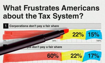

A survey during peak tax filing season reveals two big complaints that Americans have with the federal tax system.
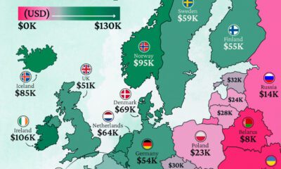
Which European economies are richest on a GDP per capita basis? This map shows the results for 44 countries across the continent.
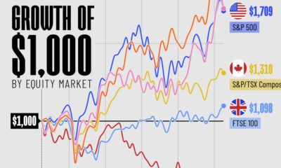
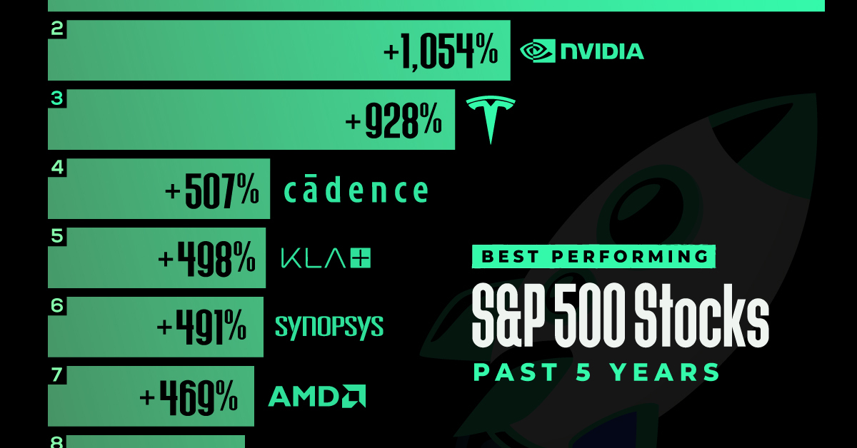
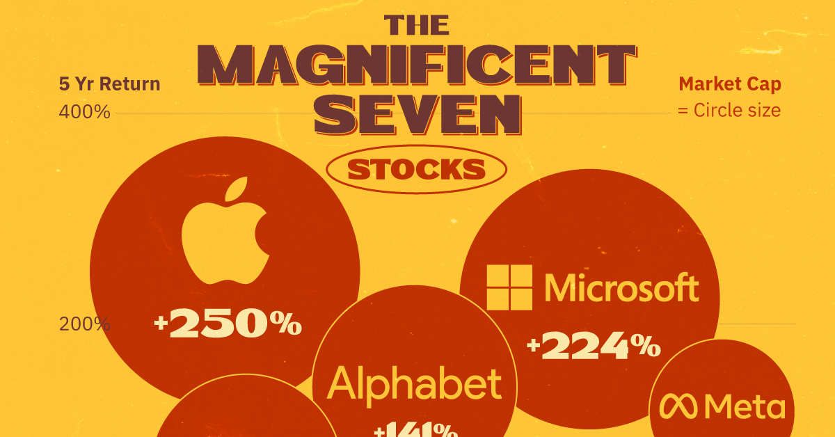
In this graphic, we've visualized stock market growth by country over the past five years using major indices.
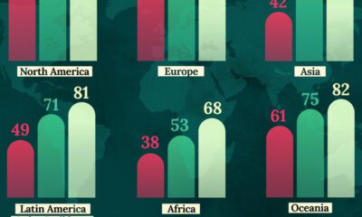
This map shows life expectancy at birth for key global regions, from 1950 to 2050F.

Over the past decade, thousands of AI startups have been funded worldwide. See which countries are leading the charge in this map graphic.

Six businesses in the broader financial space are present on this list of the largest companies, by market cap, in each Southeast Asian country.
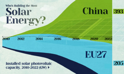

China's solar capacity triples USA, nearly doubles EU.


Between 1990 and 2022, preventable child deaths more than halved. However there are still challenges to overcome.
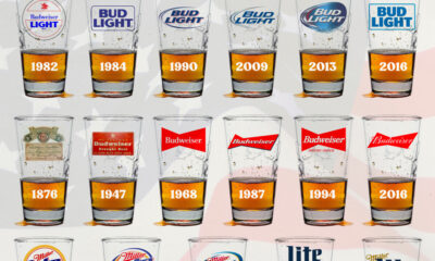

In this graphic, we analyze the evolution of popular U.S. beer logos like Budweiser, Coors Light, Bud Light, and more.
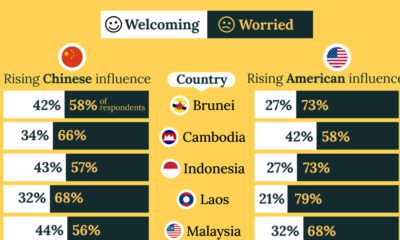
A significant share of respondents from an ASEAN-focused survey are not happy about rising American and Chinese influence in the region.