Money
Charted: Income Distributions in 16 Different Countries
Article/Editing:
Charting Income Distributions in 16 Different Countries
Throughout the 19th century, roughly 80% of the global population lived in what we’d now consider extreme poverty.
And as earnings and living conditions have improved dramatically since then, they haven’t done so evenly across the world. There are still vast income gaps, both between different countries and within them.
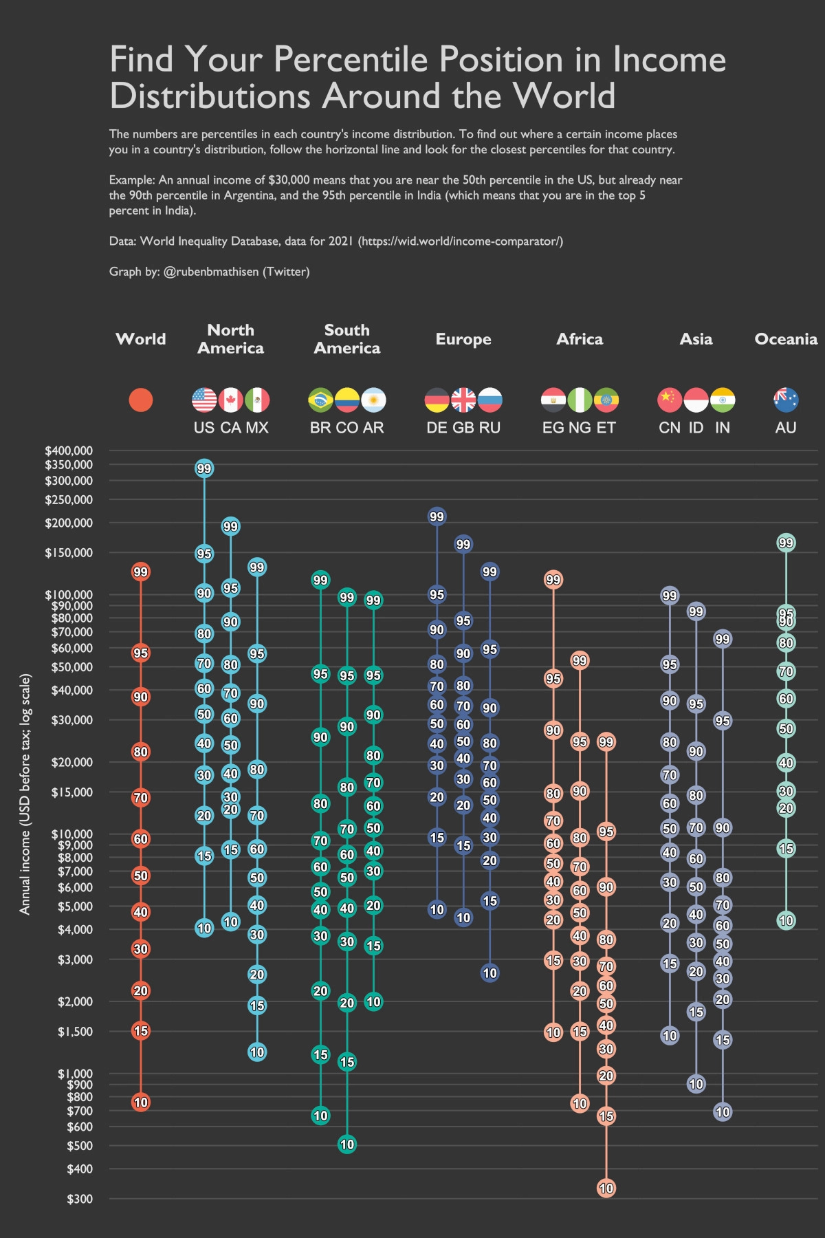
To highlight these global income discrepancies, this chart by Ruben Berge Mathisen shows income distributions around the world, using 2021 income data from the World Inequality Database (WID) on a per adult basis.
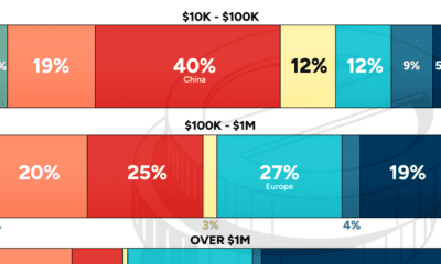
Global Income Distributions
This graphic shows the adult income distributions of 16 different countries in U.S. dollars, along with the world average.
On a global scale, adults making an annual income greater than $124,720 make it into the 99th percentile, meaning they make more than 99% of the worldwide population.
However, things change when you zoom in on specific countries. Here’s a look at all the countries on the list, and how much annual income is needed (at minimum) to be in the top 1%:
| Region | Country | Adult income (2021, 99th percentile) |
|---|---|---|
| North America | 🇺🇸 United States | $336,953.19 |
| North America | 🇨🇦 Canada | $193,035.55 |
| North America | 🇲🇽 Mexico | $130,388.19 |
| South America | 🇧🇷 Brazil | $115,257.86 |
| South America | 🇨🇴 Colombia | $97,500.37 |
| South America | 🇦🇷 Argentina | $94,794.89 |
| Asia | 🇨🇳 China | $99,095.34 |
| Asia | 🇮🇳 India | $65,370.51 |
| Asia | 🇮🇩 Indonesia | $85,176.35 |
| Europe | 🇷🇺 Russia | $124,805.86 |
| Europe | 🇩🇪 Germany | $212,106.53 |
| Europe | 🇬🇧 United Kingdom | $162,547.56 |
| Africa | 🇳🇬 Nigeria | $53,144.36 |
| Africa | 🇪🇹 Ethiopia | $24,295.66 |
| Africa | 🇪🇬 Egypt | $115,546.44 |
| Oceania | 🇦🇺 Australia | $164,773.40 |
| 🌎 World | $124,719.60 |
People in America’s top 1% make at least $336,953 in annual pre-tax income. That’s more than $100,000 above the 1% of next closest countries, Germany ($212,107) and Canada ($193,036).
On the flip side, adults in Ethiopia only need to make $24,297 to fall into the country’s 99th percentile. Ethiopia is one of the poorest nations in the world—according to estimates by the World Bank, about 27% of Ethiopia’s population is thought to be currently living under the poverty line.
Income Gaps Within Countries
It is also noticeable how much income varies within each country.
One example is Colombia, which has one of the largest wealth gaps of any country on the list. The 99th percentile in Colombia is making an annual income that’s 192x higher than its 10th percentile. In contrast, an income in the 99th percentile in the United States is 83x higher than the 10th percentile.
Colombia’s high level of income inequality stems from early childhood disadvantages, such as lack of access to education, which can limit opportunities later on in life.

This article was published as a part of Visual Capitalist's Creator Program, which features data-driven visuals from some of our favorite Creators around the world.


Wealth
Visualizing the Tax Burden of Every U.S. State
Tax burden measures the percent of an individual’s income that is paid towards taxes. See where it’s the highest by state in this graphic.
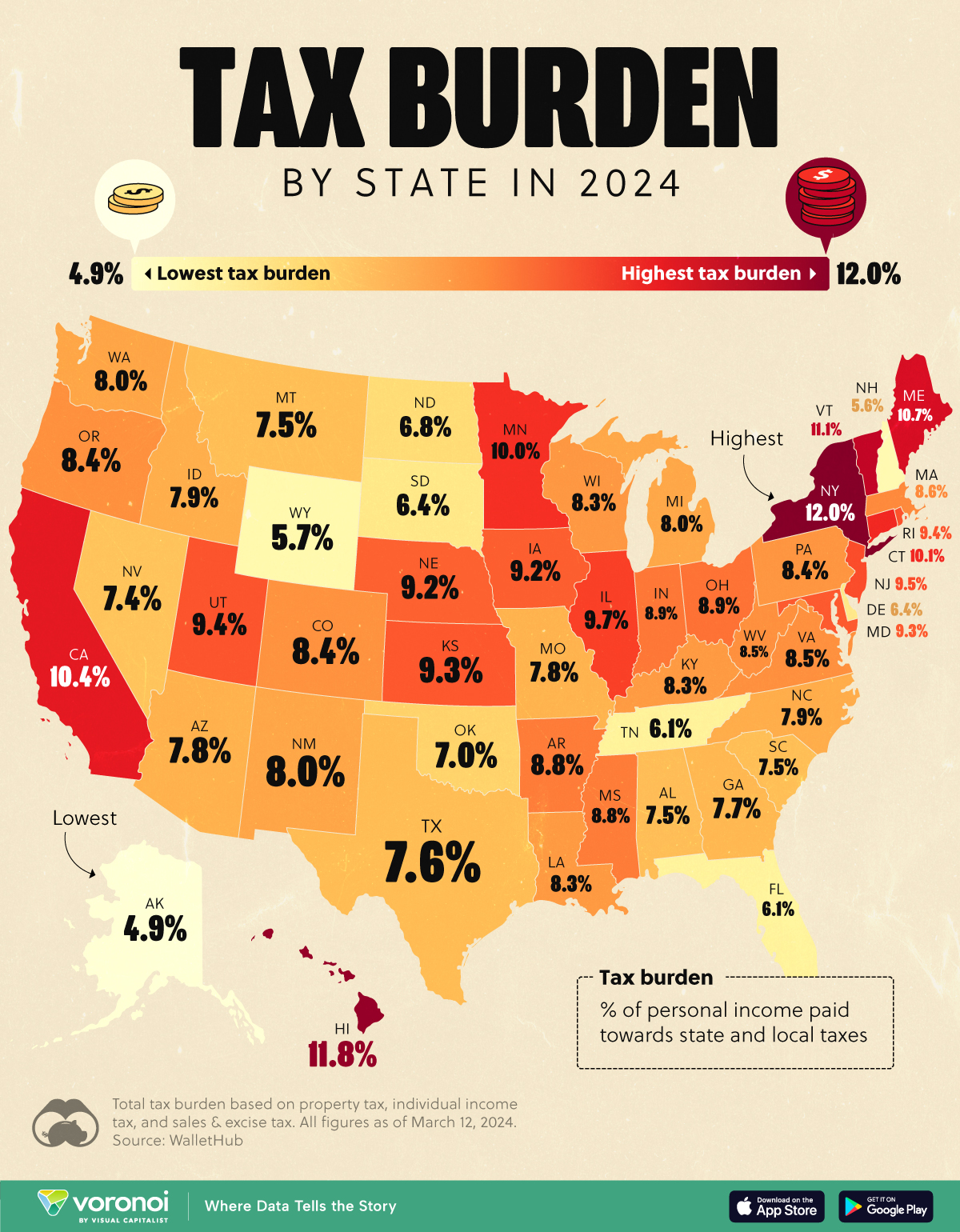
Visualizing the Tax Burden of Every U.S. State
This was originally posted on our Voronoi app. Download the app for free on iOS or Android and discover incredible data-driven charts from a variety of trusted sources.
This map graphic visualizes the total tax burden in each U.S. state as of March 2024, based on figures compiled by WalletHub.
It’s important to understand that under this methodology, the tax burden measures the percent of an average person’s income that is paid towards state and local taxes. It considers property taxes, income taxes, and sales & excise tax.
Data and Methodology
The figures we used to create this graphic are listed in the table below.
| State | Total Tax Burden |
|---|---|
| New York | 12.0% |
| Hawaii | 11.8% |
| Vermont | 11.1% |
| Maine | 10.7% |
| California | 10.4% |
| Connecticut | 10.1% |
| Minnesota | 10.0% |
| Illinois | 9.7% |
| New Jersey | 9.5% |
| Rhode Island | 9.4% |
| Utah | 9.4% |
| Kansas | 9.3% |
| Maryland | 9.3% |
| Iowa | 9.2% |
| Nebraska | 9.2% |
| Ohio | 8.9% |
| Indiana | 8.9% |
| Arkansas | 8.8% |
| Mississippi | 8.8% |
| Massachusetts | 8.6% |
| Virginia | 8.5% |
| West Virginia | 8.5% |
| Oregon | 8.4% |
| Colorado | 8.4% |
| Pennsylvania | 8.4% |
| Wisconsin | 8.3% |
| Louisiana | 8.3% |
| Kentucky | 8.3% |
| Washington | 8.0% |
| New Mexico | 8.0% |
| Michigan | 8.0% |
| North Carolina | 7.9% |
| Idaho | 7.9% |
| Arizona | 7.8% |
| Missouri | 7.8% |
| Georgia | 7.7% |
| Texas | 7.6% |
| Alabama | 7.5% |
| Montana | 7.5% |
| South Carolina | 7.5% |
| Nevada | 7.4% |
| Oklahoma | 7.0% |
| North Dakota | 6.8% |
| South Dakota | 6.4% |
| Delaware | 6.4% |
| Tennessee | 6.1% |
| Florida | 6.1% |
| Wyoming | 5.7% |
| New Hampshire | 5.6% |
| Alaska | 4.9% |
From this data we can see that New York has the highest total tax burden. Residents in this state will pay, on average, 12% of their income to state and local governments.
Breaking this down into its three components, the average New Yorker pays 4.6% of their income on income taxes, 4.4% on property taxes, and 3% in sales & excise taxes.
At the other end of the spectrum, Alaska has the lowest tax burden of any state, equaling 4.9% of income. This is partly due to the fact that Alaskans do not pay state income tax.
Hate Paying Taxes?
In addition to Alaska, there are several other U.S. states that don’t charge income taxes. These are: Florida, Nevada, South Dakota, Tennessee, Texas, Washington, and Wyoming.
It’s also worth noting that New Hampshire does not have a regular income tax, but does charge a flat 4% on interest and dividend income according to the Tax Foundation.
Learn More About Taxation From Visual Capitalist
If you enjoyed this post, be sure to check out this graphic which ranks the countries with the lowest corporate tax rates, from 1980 to today.

-

 Healthcare4 days ago
What Causes Preventable Child Deaths?
-

 voronoi2 weeks ago
Best Visualizations of April on the Voronoi App
-

 Wealth2 weeks ago
Charted: Which Country Has the Most Billionaires in 2024?
-

 Markets2 weeks ago
The Top Private Equity Firms by Country
-

 Jobs1 week ago
The Best U.S. Companies to Work for According to LinkedIn
-

 Economy1 week ago
Ranked: The Top 20 Countries in Debt to China
-

 Politics1 week ago
Charted: Trust in Government Institutions by G7 Countries
-

 Energy1 week ago
Mapped: The Age of Energy Projects in Interconnection Queues, by State